
Local Stories
When Main Street Stops Telling People It’s Alive
A town can look as though it stopped moving even when the people inside it have not. On Hellertown, familiar storefronts, and the small signs that someone still cares.
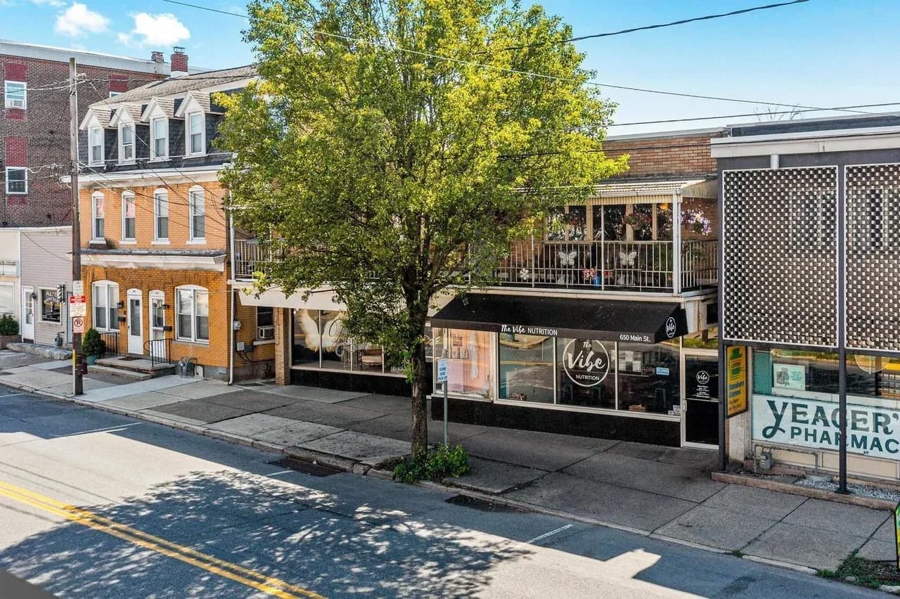
A town can look as though it stopped moving even when the people inside it have not.
That is not a verdict on the people. It is a problem with the signals reaching the street.
A business may have a thoughtful owner, a busy back room, and customers who would recommend it without hesitation. Someone passing for the first time sees something much smaller: a window, a name, a door, perhaps a sign glimpsed between parked cars. Later, they might see a search result or a website on a phone.
Those fragments have to answer a few ordinary questions. What is this place? Is it open? Would I feel comfortable walking in? Is the information current enough to trust?
When the answers become hard to find, a place can seem absent while it is still very much there.
This is about the street, not a hit list
The photographs accompanying this essay show Hellertown as context. They are not a ranking of storefronts, and they do not establish the health of any business pictured. A photograph cannot tell us a shop's finances, the circumstances of its owner, or what happened behind its door that morning.
That limit is worth saying plainly. Small businesses already carry enough pressure without a design essay turning their windows into evidence for a public scolding.
The question is broader: how does the everyday communication of a town accumulate? What happens when signs, windows, websites, and search listings slowly drift away from the activity they are meant to represent?
You do not need to dislike a place to notice that gap. Sometimes affection is the reason it becomes hard to ignore.
Hellertown's streetscape is the setting for this essay, not a scorecard for the businesses in the frame.
Age can be character
An old sign can be wonderful.
It can carry a shape, a typeface, a material, or a slightly odd proportion that would disappear in a standard modern template. It may help people recognize a block. It may be part of how someone gives directions: turn after that sign, cross by that building, meet near that corner.
There is no reason to sand all of this down until every storefront resembles the same recent development. A town does not become more welcoming by erasing every trace of having existed before this year.
Age and neglect are different things. An old sign that is cared for tells one story. A sign that no longer answers basic questions tells another. A weathered surface can have character while accurate hours sit beside it. Traditional lettering can remain while a new photograph shows what is happening inside.
The goal is continued attention, not permanent newness.
The temporary sign that never leaves
Temporary communication often begins as a sensible response to a busy day. A printer is available. Tape is available. The hours changed, a delivery arrived late, or an entrance moved. Make a notice and keep going.
The difficulty starts when the temporary layer becomes the permanent system. Another note arrives. An older one stays. A price is crossed out. The paper fades. Important information is now one item among several competing messages.
To someone who knows the business, this may be easy to decode. To a new visitor, it can become work.
A window should not require an archaeological reading. If the visitor has to guess which notice is newest, the business has transferred a small piece of uncertainty to someone who has not yet decided to enter.
The fix does not necessarily involve a designer. Often it begins with taking everything down, checking what still needs to be said, and putting back fewer things.
Familiarity can hide the problem
People who live near a place become very good at not seeing it.
This is useful. Nobody could get through a normal day if every familiar sign demanded a fresh decision. We learn the route, recognize the outline, and save our attention for something else.
But that habit can make a change difficult to communicate. A business may add a service, improve its interior, or change ownership while the outside continues to look almost exactly as it did. Regulars know. Everyone else drives past the old mental picture.
This is one reason a current photograph can matter. It gives people something specific to notice again. A repaired window display or a legible description can do the same job. Neither has to shout. They just have to make the present tense visible.
The message is small: someone is here, this is what happens here, and this information has been looked at recently.
The website is another window
Physical and digital presence are often treated as separate projects. One belongs to the building. The other belongs to whoever knows the password.
A visitor does not experience that distinction. They see a name on the street, search for it, and expect the next thing to make sense. If the colors, wording, photographs, or business description seem unrelated, they have to decide whether they found the right place.
The most damaging mismatch can be very ordinary. A site might describe services that changed years ago. A phone number might be wrong. Hours might disagree across two pages. A photograph might show a room that no longer exists in that form.
None of this proves that a business does not care. It often proves that a small amount of maintenance kept losing to more urgent work. But the visitor receives the result, not the explanation.
A website can be visually modest and still do this job well. It needs to tell the truth, load reliably, and help someone take the next step.
Accuracy is a form of welcome
Imagine visiting somewhere for the first time with limited time between two other commitments. Knowing whether the door will be open is not a minor detail. It determines whether the trip is worth making.
The same is true for an entrance, a method of contact, or a service description. Clear information reduces the number of questions someone has to ask before they can become a customer.
That is especially valuable for people who do not already feel like insiders. A regular knows where to park and which door is used. A newcomer may not. If the answers live only in the heads of existing customers, the place can feel harder to enter than anyone intended.
Good communication is not the same as aggressive selling. Sometimes it is simply hospitality made visible before a person arrives.
A small maintenance habit beats a dramatic rescue
It is tempting to treat this as a large branding problem. Sometimes it is. Often the first useful work is much smaller.
Look at the storefront from across the street. Then look at it as a pedestrian. Read the hours without filling in what you already know. Open the website on an ordinary phone. Follow the contact link. Compare the search listing with the notice on the door.
Make a short list of disagreements. Fix those before debating a new logo.
The benefit of a small routine is that it can happen again. A complete overhaul that becomes untouchable for another decade may repeat the original problem. A few photographs, a saved account recovery method, and an occasional check of the main pages create a more manageable responsibility.
Maintenance is less glamorous than a reveal. It is also how a place keeps making sense.
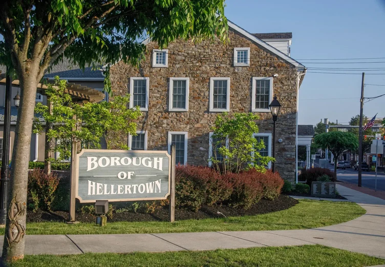
A civic landmark offers a reminder that local identity can be recognizable without being new. The question is how to keep that identity cared for.
Leave room for the person running the place
There is usually a reason work has been postponed. Money, time, illness, family responsibilities, an awkward landlord relationship, or simply the daily effort of staying open can change what is possible.
An outside observer does not know which of those applies. Advice should leave room for that uncertainty.
For theProject., being nearby should mean understanding more of the situation before suggesting an answer. A business may need a replacement panel, better photographs, a repaired website, or help recovering access to an existing account. It may not need a grand new identity at all.
The sensible question is what small change would make the place easier to understand now, and what arrangement would make it easier to keep accurate later.
Signs of life
Hellertown does not need to become a collection of matching storefronts. Its age, differences, and peculiarities are part of the place.
A local business does not need a rebrand every year. It needs signs of life.
A clean sign. Accurate hours. A current photograph. A website that works. A window that tells you what is inside. A reason to look twice.
None of these replaces the people doing the work. They help the rest of us notice that the people are still there.