
Local Stories
A New Front Door at 110 Main Street
A former pharmacy becomes a health center in Hellertown. The opening raises a practical design question: how do signs, directions, hours, and websites help someone find the right entrance?
A building can keep the same address and become an entirely different kind of invitation.
At 110 Main Street in Hellertown, a former Rite Aid is now a St. Luke’s Health Center. St. Luke’s announced that it opened on August 24, 2026. Its announcement describes a renovated 13,000-square-foot building, a relocated and expanded family practice, walk-in care, X-ray, laboratory services, and occupational medicine.
Those are the reported facts. The design question they raise is smaller and surprisingly demanding: when the use of a place changes, how does everybody else learn how to use it?
An address gets someone to the vicinity. A good front door gets them through the next decision.
The building is only the first introduction
St. Luke’s says the renovation included improvements to access ramps, exterior lighting, the parking lot, and landscaping. These details deserve attention alongside the list of services. They concern the stretch between deciding to visit and arriving inside.
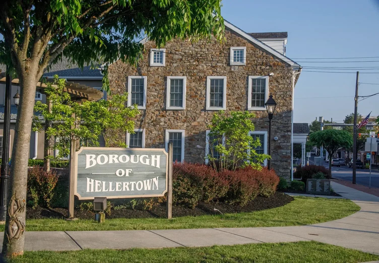
This article is commentary on the announced opening, not a review of the center or an accessibility inspection. We haven’t tested its entrances or audited its website. The photograph shows Hellertown’s civic setting, not the health center. St. Luke’s is not a theProject. client.
The opening is nevertheless a good reason to think about entrances. A visitor meets a place in several forms before meeting a person. A map result. A street sign. A search snippet. A website. A parking area. A door. Each can either answer the next question or introduce another one.
Someone who knows a town well can miss how much interpretation a first visit requires. Familiarity supplies missing instructions. You know which driveway to use because you’ve used it before. You know a side entrance exists because a neighbor mentioned it. A newcomer has neither advantage.
One building, several clocks
The opening announcement lists different hours for different services. That is a useful example of why a single opening-hours box can be insufficient. “The building is open” and “the service I need is available” are different facts.
We aren’t reproducing those hours here. A Journal article becomes an unreliable directory as soon as a schedule changes. The current service pages should remain the source for planning a visit.
For any business with several services, the design lesson is practical. Put the service beside its hours. Keep labels consistent between the website and the sign. If appointments and walk-ins follow different rules, say so before someone makes a trip.
A short qualification can save an awkward arrival. It also saves staff from explaining the same distinction throughout the day. The writing does some of the welcoming before a person has time to do it.
Design for someone with less spare attention
It’s tempting to imagine a website visitor sitting comfortably with a large screen and unlimited patience. Many visits happen with one thumb, a weak connection, or a child asking a question beside the phone.
That changes the order of information. A long statement about an organization’s mission may matter, but it probably shouldn’t come before the address, the service name, and what to do next.
A useful exercise is to write down the questions a visitor must resolve in order. Am I in the right place? Does this location provide what I need? When can I come? Do I need to arrange anything first? How do I reach a person if I’m still unsure?
These questions aren’t a demand for a dull website. They give its visual hierarchy a job. Large type can identify the location. A simple rule can separate services. A visible link can lead to current directions. The choices earn their space by helping somebody proceed.
The digital entrance has physical consequences
A confusing page does not stay on the screen. It can turn into a wasted journey, an unnecessary call, or a late arrival. That makes website maintenance part of operating a place.
A small business can begin with a modest review. Read its homepage on a phone. Follow the directions link. Check that the telephone link reaches the intended number. Compare the posted schedule with the window. Ask somebody unfamiliar with the business to describe what they think happens there.
Don’t coach them through the exercise. The point is to hear where the explanation breaks. If you have to say “everyone knows that,” you may have found something worth writing down.
Physical and digital accessibility also require more than a clean visual design. A readable page can still be impossible to use with a keyboard. An obvious door can still be difficult to reach. Different needs require different checks; a photograph alone cannot certify either one.
Moving should include the old directions
A relocation produces old information as well as new information. Existing customers may remember an earlier address. Search results may retain an outdated description. Printed materials may stay in circulation.
The helpful response is not to expect everybody to discover the newest page. It is to give old information a route forward where the business controls it. Update the old location page. Explain the move in plain language. Keep a stable contact route. Make the new address easy to copy.
This is especially important when a familiar building changes purpose. Neighbors may continue to call it by its former occupant for years. That is ordinary local memory, not a branding failure. Good communication can work with it: enough context to orient people, followed by the information they need now.
A front door is a promise to help
The most useful entrance doesn’t require a visitor to understand the organization behind it. It offers the next step at the moment that step matters.
The change at 110 Main Street gives Hellertown a concrete example to think about. A place can be familiar and new at once. The responsibility is to make that change legible to people who have other things on their minds.
A business does not need the budget of a health network to learn from that problem. It needs an accurate address, an honest description, current hours, understandable directions, and a way to ask for help. Keeping those pieces in agreement is a small design task with a very physical result: someone gets where they meant to go.
Sources / further reading
St. Luke’s Health Center in Hellertown Opens to the Public — St. Luke’s University Health Network, 2026-08-24. Opening and facility details. Check current service pages before a visit.