
Identity / public redesign / 2026
Relentless Design Foundation
A crowded collection of capabilities became a clearer studio: less taxonomy, more work, and a visual language with nerve.
- Project
- Relentless
- Built
- 2026
- Role
- Identity, product, frontend
Project story
The public site became its own proof that strong art direction and mature engineering do not have to compete.
The problem
The studio had become harder to understand than it needed to be.
Years of capabilities, experiments, interface ideas, and legitimate technical depth had accumulated on the public site. Each piece could defend its existence. Together, they asked too much attention from someone simply trying to understand what the studio makes.
The problem was not a lack of design system. It was a lack of edit. A visitor should not need to decode the entire organization before finding the work, the point of view, or the person behind it.
LESS TAXONOMY.
MORE WORK.
MORE IDENTITY.
The visual grammar
Four simple elements learned how to carry meaning.
Triangle
Direction + heritage
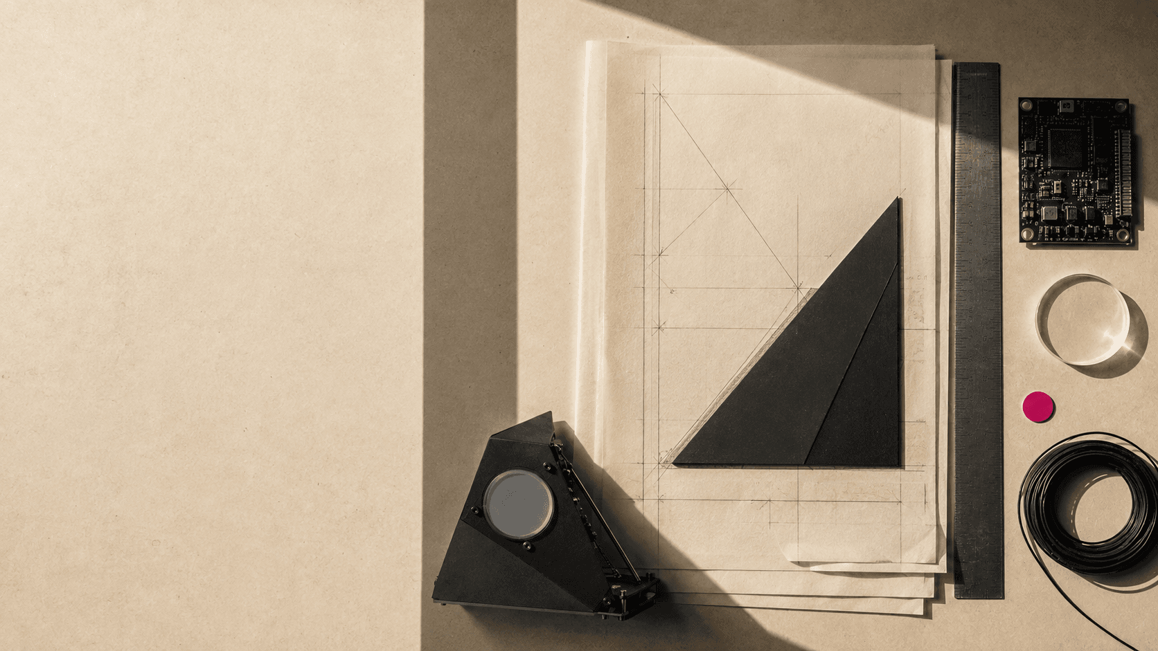
The original mark becomes a wayfinder, a crop, and a construction clue rather than a decorative stamp.
Circle
Humanity + continuity
Round form interrupts rigid structure and keeps the system from mistaking severity for confidence.
Rectangle
Structure + systems
Frames, paper, screens, and objects provide the practical containers where work becomes usable.
Line
Connection + precision
Rules align information, carry motion, and show relationships without turning the page into a diagram of itself.
The edit
Monochrome carried the structure. Color learned to punctuate.
Warm paper, ink, severe type, and unequal compositions created the base. Magenta and teal stopped behaving like a theme and became registration marks: small signals that something has aligned, changed, or needs attention.
Capabilities moved behind clearer public choices. Work gained room. Imagery became material evidence instead of wallpaper. Responsive design was treated as recomposition, not desktop squeezed into a smaller rectangle.
The hard part
The public edit did not flatten the systems underneath it.
Client Preview, private photo delivery, contact intake, Journal publishing, analytics choices, and server-only Studio communication all retained their mature boundaries.
The redesign made the studio easier to understand without pretending the underlying work was simple. Complexity stayed where it was useful, rather than becoming the public composition.
- 01Accessible hierarchy and visible focus remain foundational
- 02Reduced motion preserves every final relationship
- 03Private routes keep their quieter, protected behavior
- 04Server rendering and optimized media remain the default
The proof
The site no longer describes the foundation. It performs it.
Relentless is not a token inventory dressed as a case study. It is the act of turning a technically capable but overextended public surface into a studio with a clearer voice, stronger images, better stories, and enough restraint to make the surprising moments matter.