Design, UI/UX
& Brand Systems.
We do not just make things look better. We make them feel understood. From the first pixel to the last interaction, across web, apps, games, and every surface your brand touches.
Fluent in the systems your users already trust
- Apple HIG
- Material 3
- Fluent 2
- Swiss / International
- Motion & Spring
- Token Systems
Design is the first feeling someone has when they meet your business, product, app, game, or idea. It is the way a button invites action, the way typography creates trust, the way color sets emotion, and the way a brand becomes recognizable before a single word is read.
A brand system should feel intentional from every angle. We build identities that belong to the project — and survive production.
DESIGN LANGUAGES
Different design languages. Radically different experiences.
The same functional interface (navigation, content cards, actions, status) feels completely different depending on the underlying philosophy. This is why choosing (or creating) the right design language matters for UX: it sets expectations, emotional tone, and how easily people can understand and trust what they’re seeing.
The same functional interface feels completely different depending on the design language.
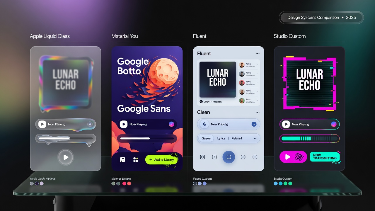
We care about the philosophy because it determines whether people feel calm, excited, or lost the second they land on your product.
Apple’s liquid glass creates calm and focus through restraint and beautiful materials. Material 3 uses bold shapes and color to create energy and clarity. Fluent prioritizes calm productivity. Our studio system brings branded personality and human warmth. Good design philosophy is not decoration — it’s the invisible structure that makes an interface feel inevitable.
THE CRAFT OF CLARITY
Great UI is not magic. It is hundreds of thoughtful decisions made visible.
Watch a deliberately broken, confusing interface get fixed one principle at a time. Each click applies a real UX improvement — hierarchy, contrast, spacing, typography, brand consistency, motion feedback, responsiveness, and systems thinking. This is how we turn friction into flow.
We do plumbing and stuff. Call us if you want.
BRAND DNA
Mix the feeling. See it become real.
Adjust the personality axes. The live preview responds with fonts, colors, spacing, buttons, and motion that actually match the direction.
Unforgettable.
Local creative technology studio turning ideas into experiences that feel human.
These four axes control the entire personality of a brand system. Every slider updates multiple properties in real time so you can feel how small direction choices cascade into a coherent experience.
TYPOGRAPHY IS FEELING
Same words. Completely different soul.
Typography is one of the fastest emotional levers in design. The same sentence can feel corporate, literary, technical, or cinematic. Great brands choose type with intention because it changes how people perceive competence and personality.
SYSTEMS & STRUCTURE
A brand system is how design survives production.
The Swiss Grid Revealer shows the invisible scaffolding (grids, spacing, hierarchy) that makes layouts feel calm and intentional. The Design System Forge demonstrates how one early decision (a color token) can and should propagate all the way to full product interfaces. This is the difference between decoration and architecture.
Every pixel has a job.
Toggle the layers. Real design is visible structure, not hidden magic.
IDENTITY IS EVERYWHERE
A logo is one mark. An identity is the world around it.
Pick an identity direction below and watch the same brand language translate across an app screen, the sign above a storefront, and an investor deck. A strong system doesn’t just look consistent — it feels like the same soul in completely different contexts. That’s what makes a brand recognizable and trustworthy no matter where people encounter it.
theProject.
darkFrost
Chapter II unlocked
The frost remembers you.
iOS app
theProject.
Creative technology
Hellertown, PA · Est. 2012
Storefront signage
Brand foundations
Identity,
systemized.
Pitch deck
Pick a direction. The app, the sign on Main Street, and the investor deck all move together — that's what an identity system means.
TASTE. CLARITY. EMOTION. USABILITY. MEMORY.
We build the identity system behind the experience.
Not just screens. Not just logos. The way people feel every time they interact with you.
Hellertown-based. We think in systems and feel in moments.